Visuals are really important to people when playing a tabletop game, especially one with miniatures. Often just as important as the models in a game is the table and terrain to match them.
We are quite fortunate in the studio that when we develop a range we have the talented creatives on board to design and develop terrain for our games. Becca and Curtis from our terrain team take a look at the forthcoming Dunsmouth range. Although primarily designed for our 1920’s horror setting, Mythos, it is useful for hobbyists in a wide range of other games.
Mythos - coming to a tabletop near you in 2020!
Becca: When Curtis and I were first given this project brief I was excited to have the opportunity to work on a new set of terrain that can be used with our new Mythos game. After receiving the project brief, we started by researching existing artwork and photos to gather reference images. This helps us imagine the general style of the range and we can start designing from there.
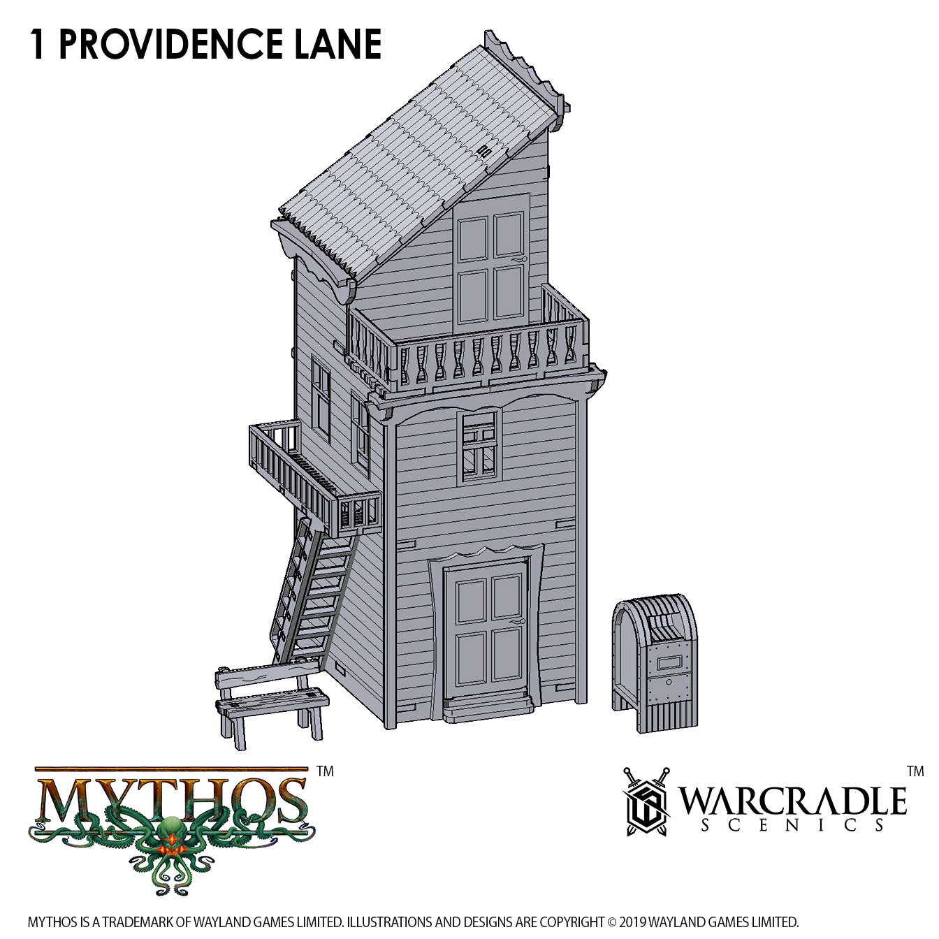
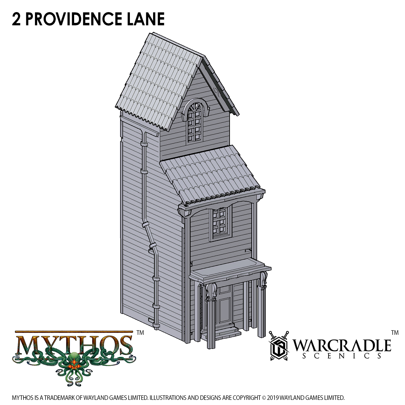
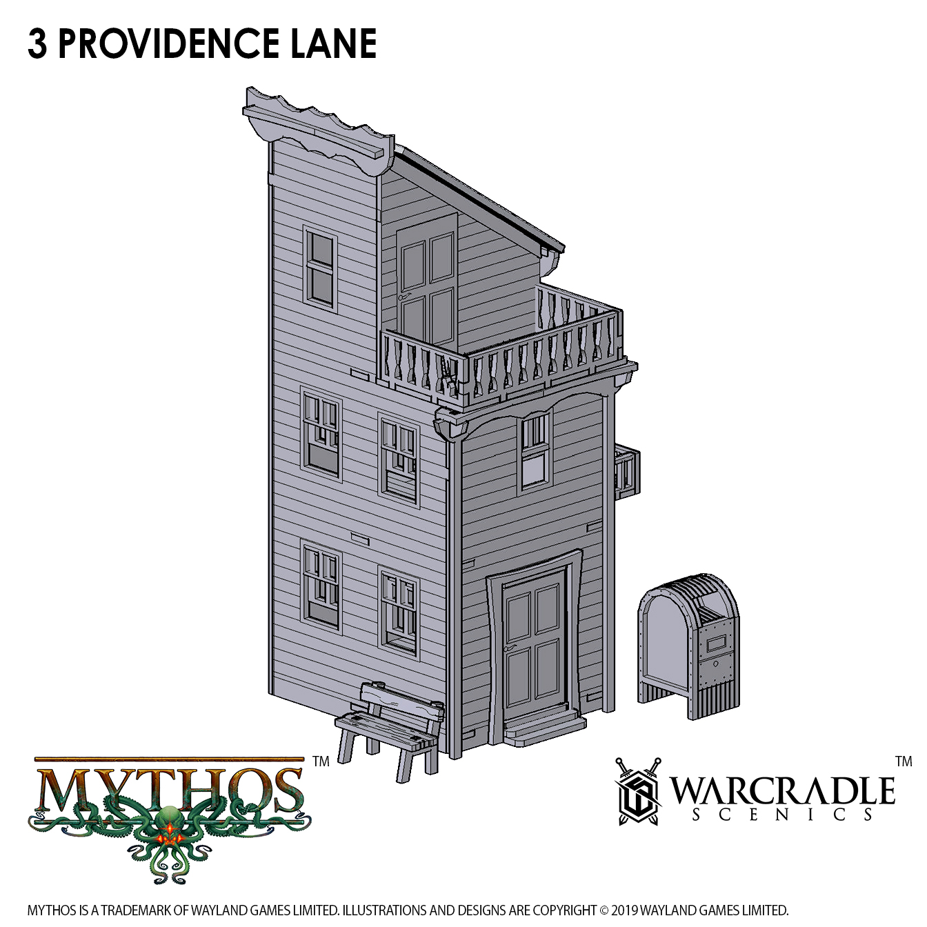
Curtis and I decided to split the range between us, into the dockside buildings (which Curtis designed) and the street buildings (that I designed), so that our own creative ideas could come through in the two sections of the terrain. However, we still made sure the overall theme of the range was coherent so it would look great on a gaming table when used together.
When designing my buildings I envisioned a 1920’s town, but with a hint of something tall, dark and creepy. Inspired by some Lovecraftian themed artwork, I enjoyed adding the subtle details of thin pointed edges and menacing tentacle-like curves. Saying that, I feel that all the products in this range could be used in a variety of different games.
Out of all them, the favourite building I designed would probably be the Clock Tower, because it has a nice amount of detail and could be made to be an interesting focal point for the town of Dunsmouth. On a more practical note, I love how the clocktower comes in two parts that stack together, making it easy for access during game play. This was an idea I’d previously used when designing the Tower in our Gloomburg range, so I knew it worked well.
Curtis: My goal was to create plausible working relationships between each separate product within the range, so that once a gaming table is laid out, everything becomes much more exciting and believable.
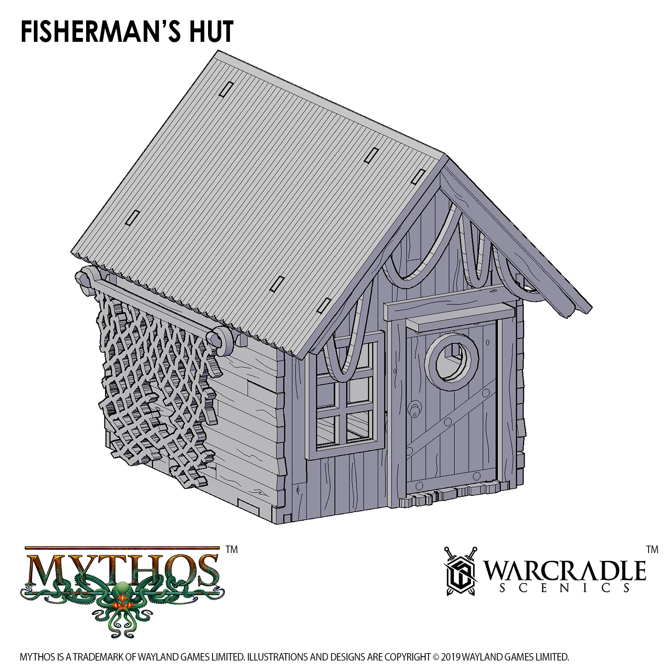
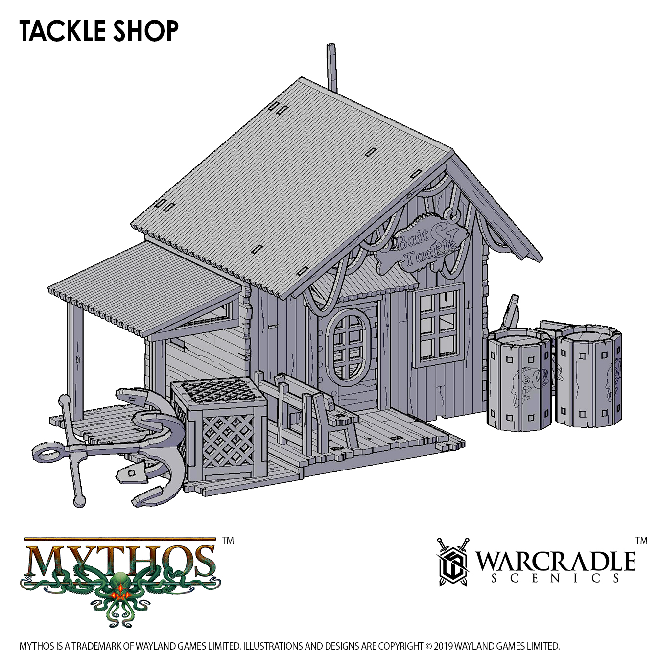
For example, the very first piece I designed was the ‘Fisherman’s Hut’ which helped me set the tone for the rest of the range. My train of thought from here was, “well if there are fishermen…there needs to be somewhere for them to buy fishing equipment” and so the Tackle Shop was created next. My favourite part of this building was designing the logo found on the side of the premises. If you look closely, you can see it has also made its way onto the barrels found as scatter with this building (and a couple of the other products too).
The fishing community of Dunsmouth obviously have to make a living, and they do so by selling their catches at the ‘Dunsmouth Market’ (If you take a look at the sign you’ll find there's something fishy going on here!).
The Angler stalks the shadows in Dunsmouth…
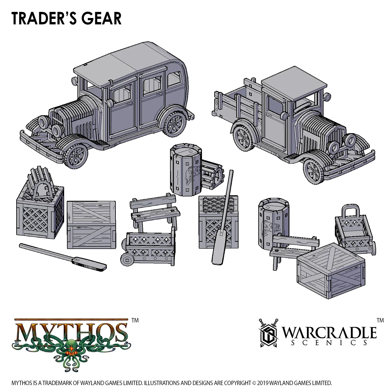
Lastly, the ‘Traders Gear’ pack provides the fishermen with a 1920’s pickup truck as a means of transporting their goods, plus there is a passenger vehicle for those members of the public looking to buy at the market. A lot of the smaller pieces such as crates, lobster cages and anchors help flesh out and finish the Dockside scene by grounding the buildings, giving players something to interact with, other than their miniatures themselves.
Scatter terrain is an important part of any tabletop skirmish game.
We hope you’ve enjoyed this sneak peek at the terrain coming for Mythos as well as an insight into our process for designing for the Warcradle Scenics range. There are regular releases every month so we’re sure to have plenty to reveal to you in another diary in the future.
Becca and Curtis


