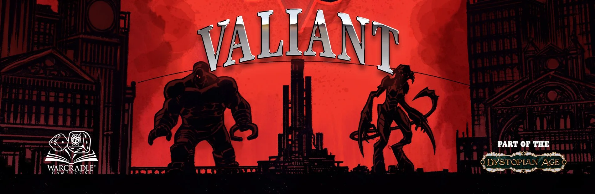
As you traverse through the locations of Valiant, meet key characters, and explore hidden secrets, the way in which you are presented with the world is of the utmost importance. Whilst descriptions alone do a great job of conjuring an image in the mind, gamebooks have allowed us to include more artwork of the Dystopian Age that is dripping with personality.
As Valiant is out now, we’re thrilled to have had the opportunity to take some time to talk with Neil Googe, Lead Illustrator on Valiant, about this exciting new medium and the opportunities it has created.
Neil Googe, Illustrator

Hi Neil, thank you for taking the time to discuss your role in creating our exciting new gamebook, Valiant.
For those unfamiliar, can you please introduce yourself?
Well, my name is Neil Googe, and I have been a professional illustrator for 30-plus years, working mainly in comics and concept art. In that time, I’ve owned and run a comics publishing and IP development company, have worked on everything from Batman to Judge Dredd, Silent Hill to World of Warcraft, and a whole lot more in between!. And now, I am working with the fine folks at Warcradle.
If you had to describe the art direction of Valiant in 3 words, what would they be?
Art direction… depends on what you mean by that. Steampunk James Bond. Hand Painted Screentones. Both of those work.
What themes do you think are the most important to focus on when illustrating key environments, characters, and creations of the Dystopian Age?
I think it's trying to capture a Victorian-era feel, but picturing what it would have been like with the technology they had. It's easy to say “steampunk”, but I think of the Dystopian Age as so much more than that due to things like the RJ power source and Sturginium. It allows them to create so much more than a normal Steampunk setting.
So of course, the world has a steampunk feel, it's the era, but I do try to steer away from “steampunk”. I think more about how the setting of particular advancements would look with a Victorian aesthetic.
Is there anything in particular you kept in mind when creating artwork to be featured in a gamebook instead of a comic or other medium?
Well, I have worked on gamebooks before, with Jon no less, and so I got a pretty good insight into the differences there. There aren’t huge amounts of differences, the key one is being aware of what is written vs what you show, something I didn’t fall foul of here, but did in my first project with Jon.
In one image for this previous project, I added a boat for scale, but there was no boat in the book's scene. In any other medium I tend to work in, this doesn’t really matter; you create images to tell the story. In a game book, it’s more that you are creating images to supplement and add tone to the story being told. What you include in those images needs to reflect what the story describes.
It’s a subtle but important difference.
How much do the written descriptions in Valiant inform your artwork, and how much does your artwork inform the descriptions?
I think this ties back to what I was just saying, the written descriptions inform the image entirely, although not necessarily the design. Thats two separate things. The image itself takes a passage from the book and illustrates that.
But the descriptions in the book can’t really go into huge amounts of detail on the design.
A good example of this would be the image and passage on the mechanical Turk (maybe my favourite image in the book), I took the moment it stands creepily in the doorway, but the automata itself was entirely my design, as the description was very brief.
But even that brief description still guides the design. I always have the description and passage readable next to me to make sure I am in the right place.
Was the choice of black and white illustration an intentional one? Is there any inspiration behind this?
No, I think it was the only choice really. Of course, in this day and age, we could have gone colour. But there's something about black and white illustrations in a novel-type format.
First, there are, of course, the old Fighting Fantasy Books, but I am also a fan of the old illustrated novels. So for me, there was no option other than that. I think the real decision was whether to make them grey-toned. I think that is what makes them feel a little more modern. The screen tones and grey tonal work rather than a flat black-and-white illustration finish.
How does the unique “through the eyes of the reader” perspective of Valiant inform the illustrations included in the gamebook
At first, I thought about taking a very “first-person” approach to the art. Every image was going to be clearly through the eyes of the reader. To the point where I considered having the reader's hand in the foreground etc. But as I planned out images, I realised that view lacks impact in some situations.
So I definitely kept the reader's perspective in mind, but in some images I shifted the camera to a point of view the reader probably wouldn’t be in, for a slightly more dramatic image over viewer-perspective accuracy.
A good example is the Asylum vs Cairo.
I did toy with the idea of having the Asylum at street level, like in Cairo. But I thought a shot of the facility as a whole built the world better than on the street. At a street level, the Asylum ran the risk of looking like any Dystopian Age factory-like structure, which the Asylum certainly is not. Whereas Cairo felt like it worked better from the reader's view than a skyline shot. From a skyline, Cairo could have run the same risk as the Asylum had from the street. It wouldn’t have had the people, the atmosphere and the small details.
Are there any differences in how you approached drawing for Valiant compared to Armoured Clash and Dystopian Wars? Did this allow you to do something unique with the setting?
Not really unique, but a lot of the work I do on Armoured Clash or Dystopian Wars is painted by someone else (James Ginn) in order to illustrate what someone can expect in the box. And so I am trying to balance drawing an interesting image, but drawing exactly the things in the box. Someone else has done all the design work already (Roberto Cirillo and the sculpting team), so I am bringing their ideas to life. In that way, it’s a lot more like working on comics or doing key art that expresses the tone of a designed world or universe.
When working on the Valiant, so much of it hasn’t been designed, so it's much more like concept art through key art. The approach is the same, but I am able to flex the creative muscles a little more.
Will Dystopian Age fans find things they recognise in the artwork of Valiant?
Oh, for sure! From different units, to Dystopian Wars ships, and even key figures, there's plenty there that Dystopian Age fans should recognise. But it also fleshes out things maybe not seen before, like the Asylum, or Cairo and adds new figures to the mix as well.
To be honest, I think there's a lot for anyone to like in the book, whether you know the Dystopian Age or not.